How to add total labels to stacked column chart in Excel?
For stacked bar charts, you can add data labels to the individual components of the stacked bar chart easily. But sometimes you need to have a floating total values displayed at the top of a stacked bar graph so that make the chart more understandable and readable. The basic chart function does not allow you to add a total data label for the sum of the individual components. However, you can work out this problem with following processes.
- Add total labels to stacked column chart in Excel (9 steps)
- Add total labels to stacked column chart with an amazing tool (2 steps)
- Create a stacked column chart with total labels in Excel (3 steps)
Add total labels to stacked column chart in Excel
Supposing you have the following table data.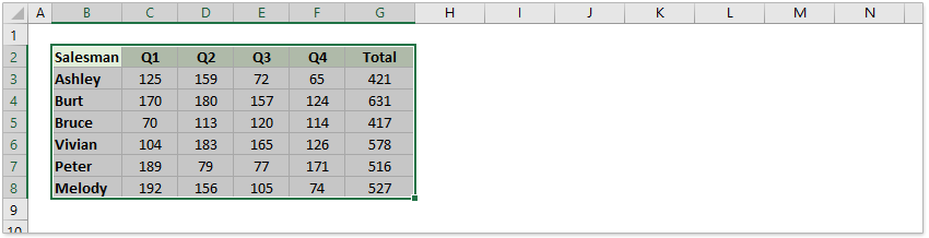
1. Firstly, you can create a stacked column chart by selecting the data that you want to create a chart, and clicking Insert > Column, under 2-D Column to choose the stacked column. See screenshots:
And now a stacked column chart has been built.
2. Then right click the Total series and select Change Series Chart Type from the right-clicking menu.
3. In the Change Chart Type dialog box, click the Chart Type drop-down list of the Total data series, select Line from the drop-down list, and then click the OK button.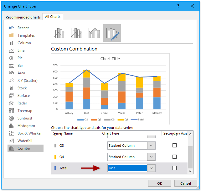
Now the Total data series has been changed to the line chart type. See screenshots:
4. Select and right click the new line chart and choose Add Data Labels > Add Data Labels from the right-clicking menu. See screenshot:
And now each label has been added to corresponding data point of the Total data series. And the data labels stay at upper-right corners of each column.
5. Go ahead to select the data labels, right click, and choose Format Data Labels from the context menu, see screenshot:
6. In the Format Data Labels pane, under the Label Options tab , and check the Above option in the Label Position section. See screenshot:
7. And then you need to make the line chart invisible, right click the line, and select Format Data Series. See screenshot:
8. In the Format Data Series pane, under the Fill & Line tab, check the No line option. See screenshot:
Now the total labels are added and displayed above the staked columns. However, the Total data series label still shows at the bottom of the chart area.
9. You can delete the Total data series label with right clicking and selecting Delete from the context menu. Alternatively, you can select the Total data series label and press the Delete key to remove it.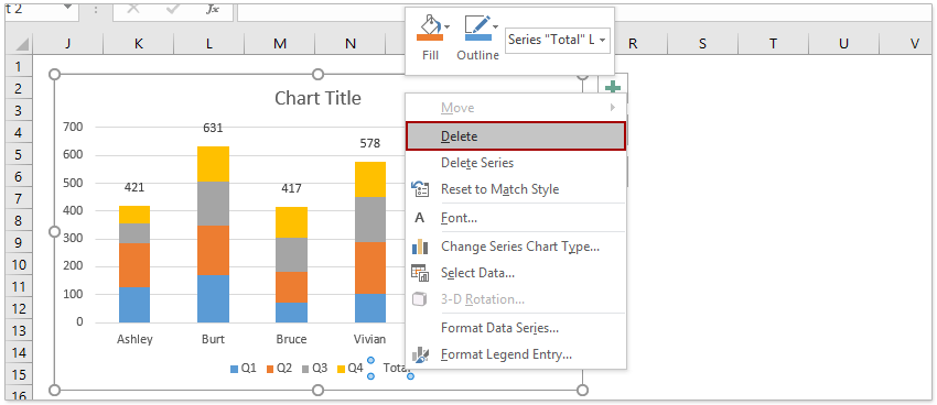
So far, you have created a stacked column chart and added the total labels for every stacked column.
Add total labels to stacked column chart with an amazing tool
If you have Kutools for Excel installed, you can quickly add all total labels to a stacked column chart with only one click easily in Excel.
1. Create the stacked column chart. Select the source data, and click Insert > Insert Column or Bar Chart > Stacked Column.
2. Select the stacked column chart, and click Kutools > Charts > Chart Tools > Add Sum Labels to Chart.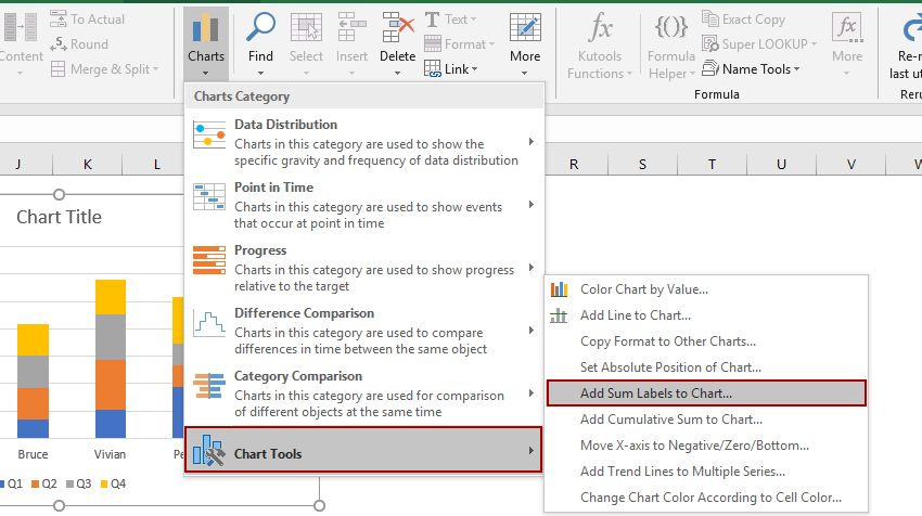
Then all total labels are added to every data point in the stacked column chart immediately.
Create a stacked column chart with total labels in Excel
If you have Kutools for Excel installed, you can quickly create a stacked column with total labels and percentage data labels at the same time with several clicks only.
1. Supposing you have prepared your source data as below screenshot shown.
2. Select the data source, and click Kutools > Charts > Stacked Chart with Percentage to enable the feature.
3. In the Stacked column chart with percentage dialog, please specify the data range, axis labels, and legend entries as you need, and click the OK button.
Tips: The Stacked Chart with Percentage feature can automatically select the data range, axis labels, and legend entries based on the selected data source. You just need to check if the auto-selected ranges are proper or not.
Now the stacked column chart with total data labels and data point labels (showing as percentages) is created.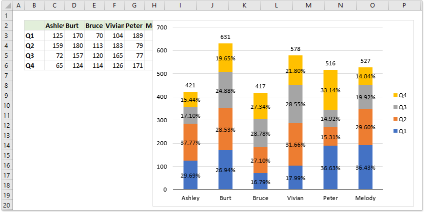
Notes:
If you do not need the percentage labels of data points, you can right click the percentage labels and select Delete from the context menu. (This operation can remove the percentage labels of one set of data series at a time)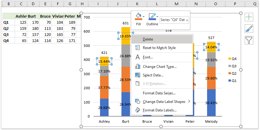
Demo: Add total labels to stacked column chart in Excel
Related articles:
- How to add a horizontal average line to chart in Excel?
- How to add a chart title in Excel?
- How to add and remove error bars in Excel?
Best Office Productivity Tools
Supercharge Your Excel Skills with Kutools for Excel, and Experience Efficiency Like Never Before. Kutools for Excel Offers Over 300 Advanced Features to Boost Productivity and Save Time. Click Here to Get The Feature You Need The Most...
Office Tab Brings Tabbed interface to Office, and Make Your Work Much Easier
- Enable tabbed editing and reading in Word, Excel, PowerPoint, Publisher, Access, Visio and Project.
- Open and create multiple documents in new tabs of the same window, rather than in new windows.
- Increases your productivity by 50%, and reduces hundreds of mouse clicks for you every day!
All Kutools add-ins. One installer
Kutools for Office suite bundles add-ins for Excel, Word, Outlook & PowerPoint plus Office Tab Pro, which is ideal for teams working across Office apps.
- All-in-one suite — Excel, Word, Outlook & PowerPoint add-ins + Office Tab Pro
- One installer, one license — set up in minutes (MSI-ready)
- Works better together — streamlined productivity across Office apps
- 30-day full-featured trial — no registration, no credit card
- Best value — save vs buying individual add-in