How to create burn down or burn up chart in Excel?
The burn down chart and burn up chart are usually used to track a progress towards a projects completion. Now I will tell you how to create burn down or burn up chart in Excel.
 Create burn down chart
For instance, there is the base data which needed to create a burn down chart as below screenshot shown:
Now you need to add some new data below the base data.
1. Under the base data, select a blank cell, here I select cell A10, type “Deal remaining work hours” into it, and in cell A11, type “Actual remaining work hours” into it, see screenshot:
2. Beside the A10 (the cell type “Deal remaining work hours”), type this formula =SUM(C2:C9) into the cell C10, then press Enter key to get the total working hours.
Tip: In the formula, C2:C9 is the range of your all task working hour cells.
3. In cell D10 beside the total working hours, type this formula =C10-($C$10/5), then drag the autofill handle to fill the range you need. See screenshot:
Tip: In the formula, C10 is the deal remaining working hours, and $C$10 is the total working hours, 5 is the number of working days.
4. Now go to cell C11 (which is beside the cell type “Actual remaining work hours”), and type the total working hours into it, here is 35. See screenshot:
5. Type this formula =SUM(D2:D9) into D11, and then drag fill handle to the range you need.
Now you can create the burn down chart.
6. Click Insert > Line > Line.
7. Right click at the blank line chart, and click Select Data in the context menu.
8. In the Select Data Source dialog, click Add button to open Edit Series dialog, and select “Deal remaining work hours” as the first series.
In our case, we specify the Cell A10 as the series name, and specify the C10:H10 as the series values.

9. Click OK to go back Select Data Source dialog, and click Add button again, then add “Actual remaining work hours” as the second series in Edit Series dialog. See screenshot:
In our case, we specify the A11 as the series name, and specify the C11:H11 as the series values.


10. Click OK, go back to Select Data Source dialog again, click Edit button in the Horizontal (Category) Axis Labels section, then select Range C1:H1 (Total and Dates labels )to the Axis label range box in the Axis Labels dialog. See screenshots:


11. Click OK > OK. Now you can see the burn down chart has been created.
You can click the chart then go to Layout tab and click Legend > Show Legend at Bottom to show the burn down chart more professional.
In Excel 2013, click Design > Add Chart Element > Legend > Bottom.

Unlock Excel Magic with Kutools AI
- Smart Execution: Perform cell operations, analyze data, and create charts—all driven by simple commands.
- Custom Formulas: Generate tailored formulas to streamline your workflows.
- VBA Coding: Write and implement VBA code effortlessly.
- Formula Interpretation: Understand complex formulas with ease.
- Text Translation: Break language barriers within your spreadsheets.
Create burn up chart
To create a burn up chart is much easier than to create a burn down chart in Excel.
You may design your base data as below screenshot shown:
1. Click Insert > Line > Line to insert a blank line chart.
2. Then right click at the blank line chart to click Select Data from context menu.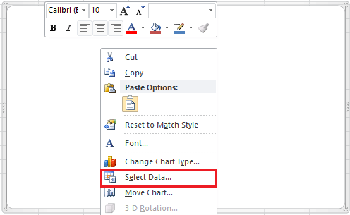
3. Click Add button in the Select Data Source dialog, then add the series name and values into Edit Series dialog, and click OK to go back to Select Data Source dialog, and click Add again to add the second series.
For the first series, in our case we select the Cell B1 (Column header of Estimated Project Unit) as series name, and specify the Range B2:B19 as the series values. Please change the cell or range based on your needs. See screen shot above.
For the second series, in our case we select the Cell C1 as series name, and specify the Range C2:C19 as series values. Please change the cell or range based on your needs. See screen shot above.
4. Click OK, now go to Horizontal (Category) Axis Labels section in the Select Data Source dialog, and click Edit button, then select data value into the Axis Labels dialog. And click OK. Now the Axis labels has been changed to date labels. In our case, we specify the Range A2:A19 (Date column) as horizontal axis labels.


5. Click OK. Now the burn up chart has been finished.
And you can put the legend at the bottom by clicking Layout tab and click Legend > Show Legend at Bottom.
In Excel 2013, click Design > Add Chart Element > Legend > Bottom.
Advanced Charts Tool |
| The Charts Tool in Kutools for Excel provides some usually used but difficult creating charts, which only need to click click click, a standard chart has been created. More and more charts are going to included in Charts Tool.. Click for full-featured 30 days free trial! |
 |
| Kutools for Excel: with more than 300 handy Excel add-ins, free to try with no limitation in 30 days. |
Related Articles:
- Create flowchart in Excel
- Create control chart in Excel
- Create emotion chart in Excel
- Create milestone chart in Excel
Best Office Productivity Tools
Supercharge Your Excel Skills with Kutools for Excel, and Experience Efficiency Like Never Before. Kutools for Excel Offers Over 300 Advanced Features to Boost Productivity and Save Time. Click Here to Get The Feature You Need The Most...
Office Tab Brings Tabbed interface to Office, and Make Your Work Much Easier
- Enable tabbed editing and reading in Word, Excel, PowerPoint, Publisher, Access, Visio and Project.
- Open and create multiple documents in new tabs of the same window, rather than in new windows.
- Increases your productivity by 50%, and reduces hundreds of mouse clicks for you every day!
All Kutools add-ins. One installer
Kutools for Office suite bundles add-ins for Excel, Word, Outlook & PowerPoint plus Office Tab Pro, which is ideal for teams working across Office apps.
- All-in-one suite — Excel, Word, Outlook & PowerPoint add-ins + Office Tab Pro
- One installer, one license — set up in minutes (MSI-ready)
- Works better together — streamlined productivity across Office apps
- 30-day full-featured trial — no registration, no credit card
- Best value — save vs buying individual add-in