How to change chart axis labels' font color and size in Excel?
Suppose you have created a chart in Excel and the Y-axis labels display numerical values. Now, you want certain axis labels to stand out—perhaps highlighting negative numbers in red, displaying positive values in a different color, or adjusting size for labels meeting certain criteria. How can you efficiently change the font color and size of selected axis label values according to such rules in Excel? This guide provides detailed steps and practical tips for various useful approaches, helping you adjust axis label formatting with ease to enhance data visualization and clarity in your charts.
Whether you need to apply a uniform change to all axis labels, highlight values with built-in number formatting, use Excel formulas for dynamic text-driven effects, format labels based on custom criteria using VBA, or overlay custom text for advanced layouts, the following solutions offer step-by-step guidance for multiple needs and situations.
➤ Change all axis labels' font color and size in a chart
➤ Change all negative axis labels' font color in a chart
➤ Change axis labels' font color by positive/negative/0 with conditional formatting in a chart
➤ Change axis labels' font color if greater or less than value with conditional formatting in a chart
➤ VBA: Change axis label font color and size with custom logic
➤ Excel formula: Generate labels in helper cells and overlay custom text
➤ Other built-in: Use formatted text boxes as custom axis labels
Change all axis labels' font color and size in a chart
When you need to change the font color and size of every label on a chart axis (X or Y) at once, Excel provides a straightforward method. This is ideal when you want unified styling for all axis numbers or text, ensuring consistency and improved visibility—such as enlarging axis values for presentations or changing colors to match branding requirements.
Click to select the axis to format (for example, click the Y-axis labels in your chart), then use the Font Size box and Font Color button in the Font group on the Home tab of the Excel ribbon to choose your desired formatting settings. This changes the entire axis at once and is suitable for basic formatting needs.
All font color and size changes you select will be applied to every label in the chosen axis, making this a quick way to improve readability or emphasize axes in your charts.
Apply conditional formatting to fill columns in a chart
Normally, all data points in a single data series share the same color. However, with the Color Chart by Value tool in Kutools for Excel, you can easily apply value-based coloring to chart columns or bars, highlighting specific data points and making patterns in your data more apparent. This feature is especially helpful for visualizing different value ranges at a glance.
Kutools for Excel - Supercharge Excel with over 300 essential tools, making your work faster and easier, and take advantage of AI features for smarter data processing and productivity. Get It Now
Change all negative axis labels' font color in a chart
In some analytical scenarios, you may want to make negative axis values stand out, such as to quickly identify losses or outliers in a data series. Excel allows you to automatically apply a different color to all negative axis labels using built-in number formatting. This method is efficient and requires no manual editing for each label.
1. Right-click the axis you wish to format (for example, the Y-axis), then select Format Axis from the context menu.
2. Depending on your Excel version, adjust the axis number formatting:
(1) In Excel2013 and later, in the Format Axis pane, expand the Number group under Axis Options. From the Category dropdown, select Number, then choose a red Negative numbers style.
(2) In Excel2007 and2010, open the Format Axis dialog, select Number from the sidebar, highlight Number under Category, and choose the negative numbers formatting you prefer.
Excel2013 and higher versions: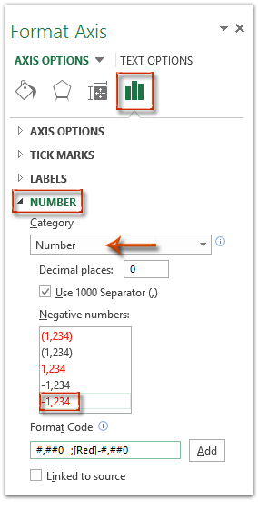
Excel2007 and2010:
Note: You can also directly enter a custom number format code such as #,##0_ ;[Red]-#,##0 into the Format Code box and click Add. To display negative values in a different color, simply change [Red] to another color name (e.g., [Blue]).
3. Exit the formatting pane/dialog. The negative labels in the selected axis now display in your chosen font color, providing immediate visual emphasis.
This method is easy to implement and works well for highlighting negative numbers, but it is limited to color-based formatting and cannot change font size automatically based on value.
Change axis labels' font color by positive/negative/0 with conditional formatting in a chart
To further enhance your axis labels, you may want to differentiate positive, negative, and zero values with distinct colors, making charts easier to interpret especially when presenting datasets with diverse value types. Excel’s custom number formatting feature can help with this, though it allows only color changes based on value sign, not size or font family changes.
1. Right-click your target axis and choose Format Axis from the context menu.
2. Format numbers according to your Excel version:
(1) In Excel2013 and later, in the Format Axis pane under Number, type[Blue]#,###;[Red]#,###;[Green]0 in the Format Code box, then click Add.
(2) In Excel2007 and2010, select Number on the left, type the same format code, and click Add.
Excel2013 and higher versions: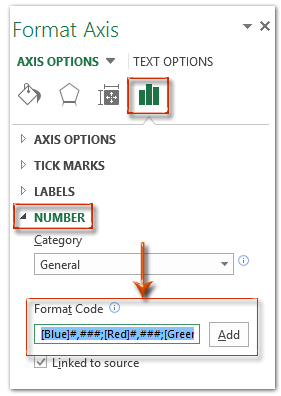
Excel2007 and2010:
Note: In [Blue]#,###;[Red]#,###;[Green]0 the first bracketed color (Blue) sets positive value colors, the second (Red) sets negative value colors, and the third (Green) sets zero value colors. Adjust the color names as needed. Only recognized Excel color names will be accepted.
3. Finish and close the dialog. Axis label colors now visually separate positive, negative, and zero values for improved data interpretation.
This method is quick, but note that only font color can be changed via this feature. Font sizes or styles cannot be affected using number format codes.
Change axis labels' font color if greater or less than value with conditional formatting in a chart
There are situations where you want to highlight axis values that fall above or below a certain numerical threshold—helpful for emphasizing cutoffs, targets, or boundaries. Again, Excel’s number formatting supports this through use of value-based color rules.
1. Right-click the axis that needs formatting, select Format Axis.
2. Adjust number format as per your Excel version:
(1) Excel2013+: In the Format Axis pane on the Number section, input[Blue][<=400]General;[Magenta][>400] in the Format Code box and click Add.
(2) Excel2007/2010: Under Number, enter the same format code and click Add.
Excel2013 and higher versions:
Excel2007 and2010:
3. Once confirmed, closing the formatting dialog updates your selected axis. For example, the format code [Blue][<=400]General;[Magenta][>400] means that labels for values of400 or less turn blue, while those over400 appear magenta. Colors and boundaries are easily customizable.
This approach is recommended for highlighting specific value regions, but it cannot adjust font size or typeface, only color.
VBA: Format chart data labels based on value (custom color & size)
If you want to customize the font color and size of data labels in your chart based on their values—such as making negative values red and larger, or positive values blue and smaller—Excel’s built-in formatting cannot handle this dynamically. With VBA (Visual Basic for Applications), however, you can apply custom logic programmatically to update each data label’s style accordingly.
This solution is ideal for dashboards, presentations, or visualizing business-critical data where label appearance should reflect numeric meaning (e.g. highlighting losses or zero values).
Steps to apply custom formatting:
1. In Excel, first select the chart you want to format. Then go to the Developer tab and click Visual Basic to open the VBA editor. In the editor, click Insert > Module, and paste the following code into the module window:
Sub CustomFormat_DataLabels_ByValue()
    Dim cht As Chart
    Dim srs As Series
    Dim i As Long

    ' Get the active chart (the one you clicked before running the macro)
    Set cht = ActiveChart
    If cht Is Nothing Then
        MsgBox "Please select a chart first, then run the macro.", vbExclamation, "No Chart Selected"
        Exit Sub
    End If

    ' Apply formatting to the first series
    Set srs = cht.SeriesCollection(1)
    With srs
        .HasDataLabels = True
        For i = 1 To .Points.Count
            Dim val As Double
            val = .Values(i)
            With .Points(i).DataLabel
                .ShowValue = True
                ' Set color and size based on value
                If val > 0 Then
                    .Font.Color = RGB(0, 102, 204) ' Blue
                    .Font.Size = 12
                ElseIf val < 0 Then
                    .Font.Color = RGB(220, 0, 0)   ' Red
                    .Font.Size = 14
                Else
                    .Font.Color = RGB(34, 139, 34) ' Green
                    .Font.Size = 13
                End If
            End With
        Next i
    End With

    MsgBox "Data labels formatted based on values.", vbInformation
End Sub2. Return to Excel, ensure your chart is selected, then run the macro by pressing F5 or using Run from the toolbar. The macro will automatically apply different font styles to each data label in the first series of your chart based on its value.
- This macro only formats the first series in the chart. To target additional series, duplicate the logic and adjust accordingly.
- The formatting logic is fully customizable. You can modify the RGB color codes, add bold/italic styling, or apply conditional font types.
- This script only works if macros are enabled and the workbook is saved in .xlsm format.
- If nothing happens when running the code, ensure you’ve selected the chart first—`ActiveChart` only detects currently selected charts.
This VBA approach lets you implement rule-based formatting for better visual communication in Excel charts, especially when highlighting value significance is key.
Excel Formula: Generate labels in helper cells and overlay custom text
Although Excel formulas cannot directly change the font color or size of axis labels, they can generate custom label text dynamically. By using helper cells to construct descriptive labels—such as adding arrows, suffixes, or formatted values—and linking these cells to data labels or text boxes, you can simulate a customized axis labeling experience driven by your data.
This approach is especially useful when you need to build annotation-rich labels that automatically update based on worksheet changes, or when combining multiple values into one label string.
Example operation steps:
1. Set up a helper column beside your chart data. For example, if your Y-axis values are in B2:B10, enter the following formula in cell C2:
=IF(B2>0,"▲ "&B2,IF(B2<0,"▼ "&B2,"0"))This formula adds a ▲ symbol for positive numbers, ▼ for negative values, and displays 0 as-is. You can modify the symbols or logic to fit your specific formatting needs.
2. Drag the formula down through column C to generate corresponding labels for each data point.
3. Create your chart as usual. To apply the custom labels:
- Option 1: Use data labels linked to helper cells
Right-click the chart’s data series → Add Data Labels. Then right-click one data label → Format Data Labels → under Label Options, deselect other options and leave “Value From Cells” checked. In the formula bar, type=and click the corresponding helper cell (e.g.,=C2), then press Enter. - Option 2: Use overlaying text boxes
Insert text boxes (Insert → Text Box), then click inside one and type=in the formula bar. Click the helper cell to link the box to it (e.g.,=C2). Format and place these text boxes manually over the chart’s axis region.
- Font color and size applied through formulas will not reflect automatically in labels; use manual formatting or VBA if dynamic styling is required.
- Linked data labels using “Value From Cells” apply the full cell content as-is; individual parts (e.g., symbols and values) cannot be formatted separately.
- This method is best for column charts, line charts, or scatter plots where you can freely place data labels or text boxes near axes.
- If chart size or data length changes, you may need to adjust the positions of text boxes manually.
- You want dynamic labels that reflect changes in worksheet values.
- You need to concatenate values (e.g., combine units, indicators, or notes).
- VBA is not an option due to macro restrictions or preference.
This formula-based workaround provides a flexible, non-VBA method for creating smart axis-like labels. However, for automation or conditional font formatting (such as color scales or value-based styles), refer to the VBA-based solution.
Other built-in: Use formatted text boxes as custom axis labels
If Excel’s native axis label formatting is too restrictive and you need full control over label appearance—such as applying mixed fonts, background colors, multiple lines, or icons—the most flexible method is to manually insert and position text boxes as custom axis labels.
This method is especially suitable for presentation charts, infographics, or dashboards that require a highly customized appearance or label layout that standard axis formatting cannot provide.
Operation steps:
- Go to the Insert tab and choose Text Box. You can insert a standard rectangle or other shapes as needed.
- Draw the text box near the axis tick mark or label location.
- Type or paste the desired text. To dynamically link the text box to a worksheet cell, click the text box, type
=in the formula bar, then select the cell. - Use the Home tab formatting tools to customize the font, size, color, background, border, and alignment.
- Repeat for each label you want to replace or customize on the chart.
- Text boxes support all formatting styles, including multi-line text, symbols, and full color control.
- Text boxes do not move with the chart automatically. If the chart or data range changes, manual repositioning may be required.
- This method is best for static charts or visual dashboards intended for reports or presentations.
- If formatting changes don’t take effect, ensure the text box is selected and not grouped with the chart.
- If you're linking to cells, verify formulas are error-free and point to correct cell values.
- For large-scale or repeating tasks, consider using VBA to programmatically insert and style labels.
- Always save a backup before performing manual edits or overlaying custom shapes.
Excel’s default axis formatting is quick and simple for most use cases. But when you need high-impact visuals or complex label layouts, manually placed and styled text boxes offer the most design freedom. While this requires more effort and lacks automation, it is ideal for one-off or presentation-ready charts.
Demo: change labels' font color on axis of chart in Excel
Related articles:
Best Office Productivity Tools
Supercharge Your Excel Skills with Kutools for Excel, and Experience Efficiency Like Never Before. Kutools for Excel Offers Over 300 Advanced Features to Boost Productivity and Save Time. Click Here to Get The Feature You Need The Most...
Office Tab Brings Tabbed interface to Office, and Make Your Work Much Easier
- Enable tabbed editing and reading in Word, Excel, PowerPoint, Publisher, Access, Visio and Project.
- Open and create multiple documents in new tabs of the same window, rather than in new windows.
- Increases your productivity by 50%, and reduces hundreds of mouse clicks for you every day!
All Kutools add-ins. One installer
Kutools for Office suite bundles add-ins for Excel, Word, Outlook & PowerPoint plus Office Tab Pro, which is ideal for teams working across Office apps.
- All-in-one suite — Excel, Word, Outlook & PowerPoint add-ins + Office Tab Pro
- One installer, one license — set up in minutes (MSI-ready)
- Works better together — streamlined productivity across Office apps
- 30-day full-featured trial — no registration, no credit card
- Best value — save vs buying individual add-in