How to show percentages in stacked column chart in Excel?
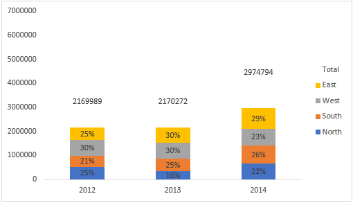
With a stacked column chart, you can view the total and partial numbers obviously, but in some cases, you may want to show the partial numbers as percentages as below screenshot shown. Now you can read the below steps to add percentages in stacked column chart in Excel.

Add percentages in stacked column chart
Easily create a stacked column chart with percentage with an amazing tool
More tutorials for charts...
Add percentages in stacked column chart
1. Select data range you need and click Insert > Column > Stacked Column. See screenshot:

2. Click at the column and then click Design > Switch Row/Column.

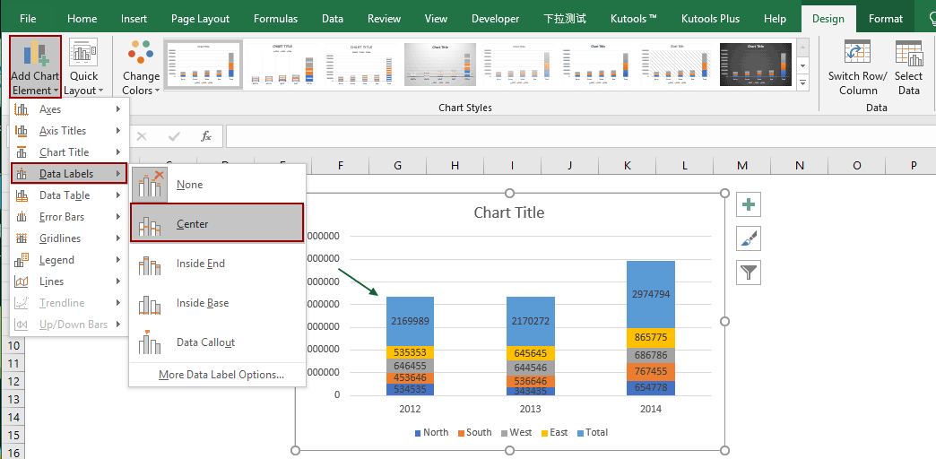
3. In Excel 2007, click Layout > Data Labels > Center.
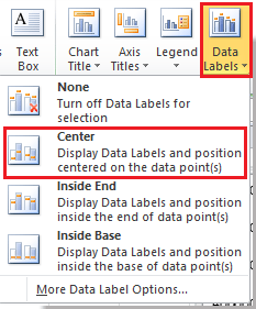
In Excel 2013 or the new version, click Design > Add Chart Element > Data Labels > Center.
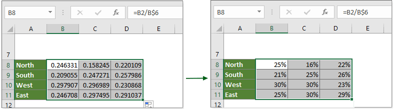
4. Then go to a blank range and type cell contents as below screenshot shown:

5. Then in cell next to the column you type this =B2/B$6 (B2 is the cell value you want to show as percentage, B$6 is the total value), and drag the fill handle to the range you need. See screenshots:

6. Select the decimal number cells, and then click Home > % to change the decimal numbers to percentage format.
7. Then go to the stacked column, and select the label you want to show as percentage, then type = in the formula bar and select percentage cell, and press Enter key.
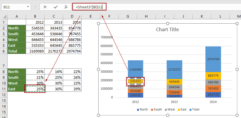
8. Now you only can change the data labels one by one, then you can see the stacked column shown as below:

You can format the chart as you need. Here I don’t fill the Total series and change the total labels as Inside Base in Format Data Series dialog/pane and Format Data label dialog/pane.
Easily create a stacked column chart with percentage with an amazing tool
The above method is multi-steps and not easy to handle. Here recommend the Stacked Chart with Percentage utility of Kutools for Excel. With this tool, you can easily create a stacked chart with percentage with only several clicks in Excel.
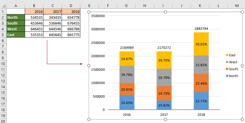
1. Click Kutools > Charts > Category Comparison > Stacked Chart with percentage to enable the feature.

2. In the popping up Stacked column chart with percentage dialog box, please configure as follows.
- In the Data range box, select the data series you will create stacked column chart based on;
- In the Axis Labels box, specify the range of axis values;
- In the Legend Entries (Series) box, specify the range of legend entries;
- Click the OK button. See screenshot:

3. Then a Kutools for Excel dialog box pops up, please click the Yes button.

Now the stacked chart is created as the below screeshot shown.
For more details about this feature, please visit here...
If you want to have a free trial (30-day) of this utility, please click to download it, and then go to apply the operation according above steps.
Related articles:
Create a bell curve chart template in Excel
Bell curve chart, named as normal probability distributions in Statistics, is usually made to show the probable events, and the top of the bell curve indicates the most probable event. In this article, I will guide you to create a bell curve chart with your own data, and save the workbook as a template in Excel.
Break chart axis in Excel
When there are extraordinary big or small series/points in source data, the small series/points will not be precise enough in the chart. In these cases, some users may want to break the axis, and make both small series and big series precise simultaneously. This article will show you two ways to break chart axis in Excel.
Move chart X axis below negative values/zero/bottom in Excel
When negative data existing in source data, the chart X axis stays in the middle of chart. For good looking, some users may want to move the X axis below negative labels, below zero, or to the bottom in the chart in Excel. This article introduce two methods to help you solve it in Excel.
Add total labels to stacked column chart in Excel
For stacked bar charts, you can add data labels to the individual components of the stacked bar chart easily. But sometimes you need to have a floating total values displayed at the top of a stacked bar graph so that make the chart more understandable and readable. The basic chart function does not allow you to add a total data label for the sum of the individual components. However, you can work out this problem with following processes.
Best Office Productivity Tools
Supercharge Your Excel Skills with Kutools for Excel, and Experience Efficiency Like Never Before. Kutools for Excel Offers Over 300 Advanced Features to Boost Productivity and Save Time. Click Here to Get The Feature You Need The Most...
Office Tab Brings Tabbed interface to Office, and Make Your Work Much Easier
- Enable tabbed editing and reading in Word, Excel, PowerPoint, Publisher, Access, Visio and Project.
- Open and create multiple documents in new tabs of the same window, rather than in new windows.
- Increases your productivity by 50%, and reduces hundreds of mouse clicks for you every day!
All Kutools add-ins. One installer
Kutools for Office suite bundles add-ins for Excel, Word, Outlook & PowerPoint plus Office Tab Pro, which is ideal for teams working across Office apps.
- All-in-one suite — Excel, Word, Outlook & PowerPoint add-ins + Office Tab Pro
- One installer, one license — set up in minutes (MSI-ready)
- Works better together — streamlined productivity across Office apps
- 30-day full-featured trial — no registration, no credit card
- Best value — save vs buying individual add-in